Is there such a thing as data underload in cycling?
- Sep 26, 2023
- 4 min read
We’ve all heard of data overload. I’m sure most cyclists have suffered it at some point or another, especially as new cycling devices offer larger screens and more data types to fill them.
The latest Garmin Edge 1040 offers up to 10 data fields on screen at the same time.
With so much data on hand, there can be a risk of becoming so hooked on the numbers on the screen that you forget to race. In some circumstance – long distance races where pacing is key, for example – being guided by the data makes a lot of sense. In others, it can perhaps lead you to be too conservative, to focus on not blowing up when maybe it could just be ‘your day’ for reaching new heights.
To that end, it’s not uncommon to hear of time trial cyclists covering up certain data fields (especially power!) or removing them from their cycling computers for racing.
But, based on some recent race experiences, I’m beginning to wonder if sometimes less is less when it comes to data and racing performance.
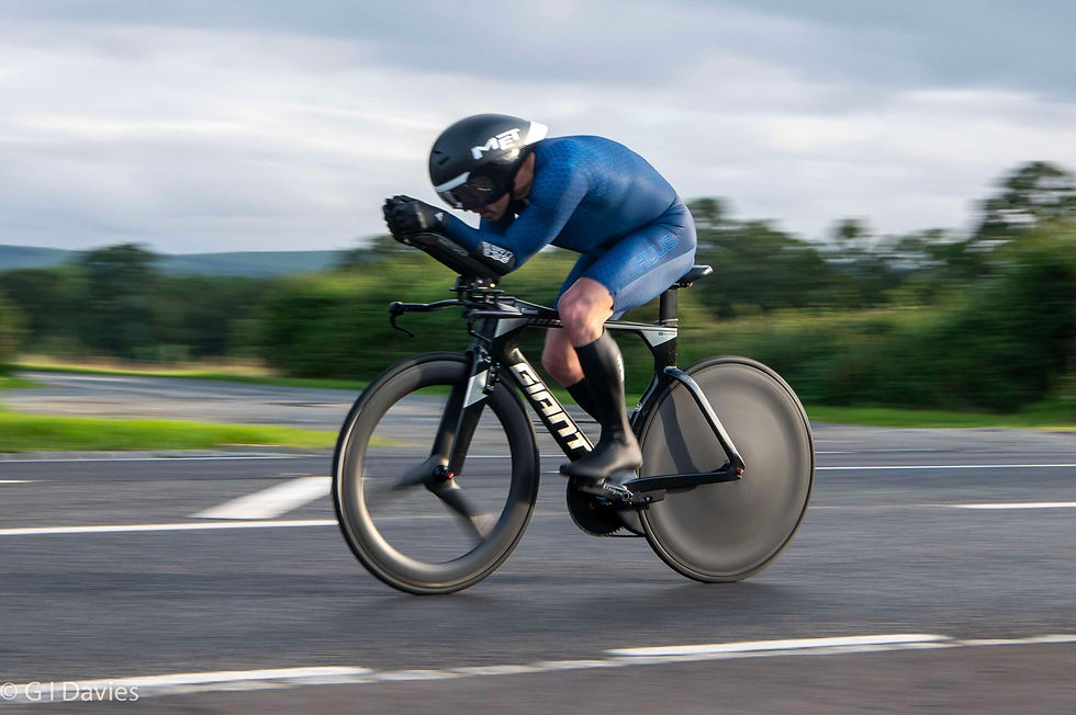
Prior to fitting a new Wattshop cockpit to the Giant Trinity earlier this year, I had been running a Garmin Edge 830 as my main TT computer, mounted between the tribars. However, through wind tunnel testing, we found some decent aero savings by bringing my elbows and hands closer together, significantly reducing the width between the new Wattshop rests and poles.
This makes the Edge 830 unworkable; just too big for the available space.
So, I dug out my old Edge 820. A slightly smaller unit. Still a bit big, but I could make it work. Almost. There are a couple of issues with the 820’s size, still. First, I have to open my forearms a little to uncover the screen. Not the biggest issue. But the second problem is that my forearms resting on the screen will often cause data fields to go into some kind of setup mode and then change the data field to something I don’t want (often it’s a power field changing to something like cadence!).
Okay, so I know a ton of you are now reading this saying “just lock the screen!”. And yeah, I should have, except I’m literally today years old finding out I can even do that!
So, NOT knowing that you can lock the screen on the Edge 820 (while still being able to use the physical start and lap buttons), and with the unit still being a little bigger than was ideal, I purchased the diminutive Edge 130.
It’s a much improved fit, allowing my arms to rest in a better position (more aero, probably only by a watt or two!) and not being susceptible to screen changes as it doesn’t have a touchscreen. But it’s also harder for my ageing eyes to read when my face is inches away from the screen (and I’m wearing contact lenses to see the road ahead!). So, I maximized the size of the data numbers by only having three fields on screen, rotating between two screens showing time/ave speed/3s power and time/distance/3s power.
Sounds okay in theory. But in the races that I’ve been running the 130, I’ve fallen short of my expectations more often than I surpassed them. Which is a bit puzzling.
In a previous post, I speculated as to whether the recent switch to a trispoke front wheel might be to blame. But having raced P881/25 this past weekend with a different wheel, and still being somewhat disappointed not only with my time but also my power, I have arrived at another theory. Suddenly it might not be the trispoke’s fault. Maybe it’s data underload.

Bear with me.
The 130 is showing alternating screens of time/distance/3s power and time/average speed/3s power. The constants being time and 3s power (reminder, I struggle to read the 130 with more than three data fields on screen).
The Edge 820 I was using previously (and I checked, it’s also the unit I’ve used to set two outright PBs over 12 months) had the following data screens: current speed, average power, 3s power, average speed, distance and time.
The big difference? Well, I don’t think it’s the speed. I think it’s the average power.
Why? Well, I think there’s a strong case for having power 3s power AND average power on screen.
Here’s my new theory. Relying only on 3s power is useful for stopping me going way over FTP at the start or on climbs, but I think it’s perhaps lulling me into a false sense of security and making me think that I’m pushing on harder than I really am. I think having average power on display is a good indicator of overall effort and whether or not I’m doing enough on the flats and descents, where I am perhaps more focused on the road ahead than the data below my nose.
Of course, I could just be fooling myself and coming up with excuses for being unfit or just not trying hard enough. I’ll have one chance to find out (hopefully) at the last 10 of the season in a couple of weeks. If I suddenly see a return to the full-race average powers I was seeing earlier in the season (prior to switching to the 130), then we’ll have an answer!
And if anyone happens to know of a unit that has similar width and length to the Edge 820, but is less than 21mm thick/deep, I’d love to hear about it! Or any clever ways to get the head unit to sit a little lower on Wattshop extensions.


Comments